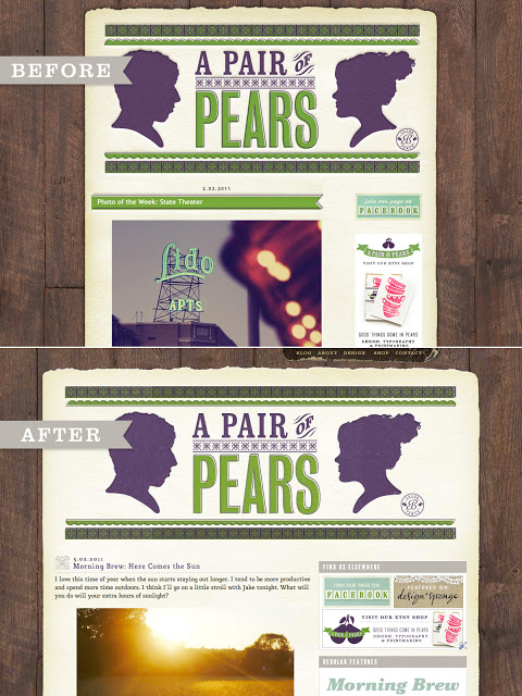
I’m sure by now you have noticed that we updated the look of our blog a little bit over the weekend. We put a lot of thought into how to make our layout as efficient as possible, while still making it something we want to look at. The whole blog is now wider, giving us much more room in the sidebar. The sidebar itself has it’s own containers now. We’ve brightened up the content’s background. Our standard font is now MidoMedium. You are now able to reply to a specific comment. We added a design page (which is still under construction). our post title layout has updated and has a new image. We added a section of our sidebar called regular features so you can easily get to a certain type of regular post.
And that’s just what I thought of off the top of my head. We’re constantly thinking of how to make our blog better. I hope you like our new look. Let us know if you love it or hate it (especially if you’re using a smartphone!), or what you think we’re missing.
(And for anyone reading this someplace other than our website, come check it out at www.apairofpears.com)

