The Face of Type “D”

Jake Blog Post Design, For the Taking, Graphic Design, The Face of Type, Typography, Wallpaper 1245 Views

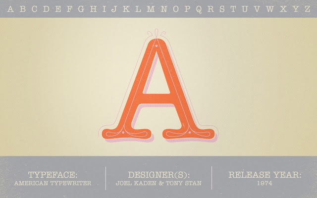
Well, the birthday season for the Bartletts has officially come to an end. But that doesn’t mean celebrations are going to stop! This month is Halloween, and along with that comes an excuse to dress up in costumes together. Here is a brand new desktop wallpaper to get you in the mood for fall decorations. For the letter D we

READ MORE

JakeThe Face of Type “D”

The Face of Type “C”

Jake Blog Post Design, For the Taking, Graphic Design, The Face of Type, Typography 2479 Views

Last month was  Jamie’s favorite, and September is mine. And it’s my favorite for the same reason: this month is my birthday! This month’s “Face of Type” is our personal favorite, Clarendon. It’s a clean, slab-serif font named after the Clarendon Press in Oxford. It was the first typeface to be registered and patented, but expired after three years and

READ MORE

JakeThe Face of Type “C”

Finders Keepers: Words of Wisdom

Jamie Bartlett Blog Post Etsy, Finders Keepers, Poster, Typography 801 Views

Source: Departika It’s the weekend! Do you have any plans? Monday is my Birthday, but we are celebrating it on Sunday with friends. I can’t wait! Jake is going to hopefully make a video and we both will take lots of pictures. I’ll be sure to share them with you sometime next week. It is going to be so fun!

READ MORE

Jamie BartlettFinders Keepers: Words of Wisdom

The Face of Type “B”

Jamie Bartlett Blog Post Design, For the Taking, Graphic Design, The Face of Type, Typography 1013 Views

It’s August, my favorite month. Can you guess why? It’s my birthday month! This month for “Face of Type” we chose Bureau Grotesque. It is a wonderful, more condensed, san serif font perfect for display.  Font Fun Fact: Bureau Grotesque is one of the fonts we use for A Pear of Pears’ Identity. Notice the word “Pears” in our blog’s header. Yep, that’s

READ MORE

Jamie BartlettThe Face of Type “B”

Lovely London

Jamie Bartlett Blog Post Design, Graphic Design, Illustration, London, Maps, Travel, Typography 1233 Views

London is, well… quite lovely if you ask me. I love the culture, the accents, and the history of city. While studying there on a college summer trip, I had a project where I was assigned to design a mind map illustrating what I did over the weekend. It was a fun personal project that always brings back fond memories

READ MORE

Jamie BartlettLovely London

The Face of Type “A”

Jamie Bartlett Blog Post Design, For the Taking, Graphic Design, The Face of Type, Typography 1235 Views

Happy July everybody! Can you believe it’s already July? This year is flying by. Today I’m excited to announce a new feature on our blog called The Face of Type. Each month Jake and I are going to pick one of our favorite typefaces, tell you a little about it and spruce up a letter from that face. We will be doing this

READ MORE

Jamie BartlettThe Face of Type “A”

Morning Brew: Where the Art is

Jamie Bartlett Blog Post Design, Graphic Design, Inspiration, Morning Brew, Quote, Typography 1111 Views

You know that plack you see hanging in everyone’s house? The one that says “Home is where the heart is”.  Well I think that quote has run it’s course. It’s kind of like when you have too much of a good thing. Here is a quote to replace it. I like this version better anyway. It’s clever, kind of corny, but fun. Source:

READ MORE

Jamie BartlettMorning Brew: Where the Art is

Morning Brew: A Good Day

Jamie Bartlett Blog Post Morning Brew, Music, Photography, Typography, Vintage 882 Views

Ever since Jake surprised me with my new smart phone I’ve been taking advantage of the alarm clock feature where you can set your alarm to play any song on your phone. My previous phone just let you to play those hideous noises that are made to make you wake up on the wrong side of the bed. In order to avoid one more morning of awful sounds, I quickly

READ MORE

Jamie BartlettMorning Brew: A Good Day

Photo of the Week: The Hauser

Jake Blog Post Architecture, California, LA, Photo of the Week, Photography, Retro, Typography, Vintage 929 Views

The Hauser has been my favorite looking apartment building ever since I came to LA. I used to pass it each day on the way to my internship during my semester of film school. None of the other buildings on Hauser Blvd. are anywhere near as cool looking. I just love the fact that someone took the time to design

READ MORE

JakePhoto of the Week: The Hauser

Showing 111–120 of 136 results