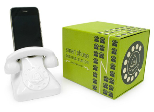
Universal Phone Dock from Jonathan Adler I love little things like this. It keeps cords neat and tidy while looking cute at the same time. Of course Jonathan Adler thought of it. He’s pretty brilliant.
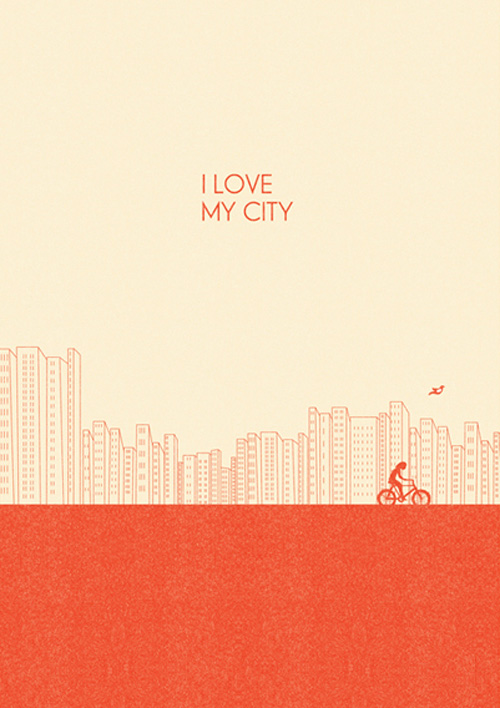
I Love My City
When Jake and I decided we would start our married life together in Los Angeles, we always had it in the back of our minds that when we wanted to have kids or buy a house, we would move out of California (or at least Los Angeles). It wasn’t until about a month ago that I really started loving California. …
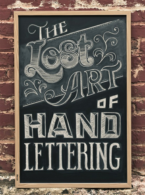
Hand Lettering
If there was one thing I could be better at, I would want it to be hand lettering. It’s so beautiful and organic. I think that’s part of my problem though. When I try drawing my own type, I tend to only see its faults, when in reality it’s the slight inconsistencies that make it beautiful. Chris Yoon Alison Carmichael Sarah …
Pantone Tarts
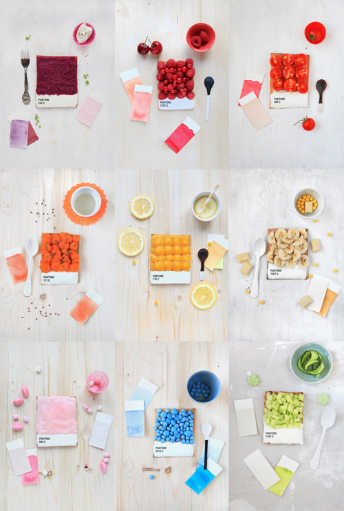
Yesterday was all about CMYK. Let’s switch it up and do Pantone today. French Food designer, Emilie de Griottes put together these dessert tarts that resemble Pantone color swatches. It’s color you can eat right up! My favorite Pantone color is Pantone 2738C. I could see that as some kind of blueberry lemon tart. Do you have a favorite Pantone color? It’s …
CMYK Wedding
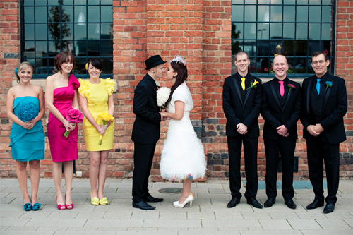
The key to any great party is a good theme. I would say Rebekah and David have the theme of all themes. What could be better than a CMYK (cyan, magenta, yellow and black) wedding? It really is perfect for any design couple who wants to show their inner art nerd. They applied the theme in such fun and clever …
The Story Behind Keeping Calm
Yesterday I found a great video explaining the history of one of my favorite WWII propaganda posters. I could go into more detail about it, but the video tells you all you need to know! Until yesterday, I had no idea the poster was never displayed until 2000. I love learning about the story of art that has inspired me. I’ve …
Ransom Letters
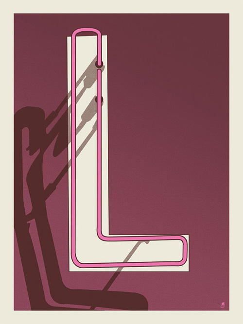
I just came across these giclee print letters this morning from Methane Studios. They have designed each letter of the alphabet so you could buy one or a whole bunch and spell out anything you can think of. Since Valentine’s Day is just around the corner I decided to spell love. The O is my favorite.
Simple is Beautiful
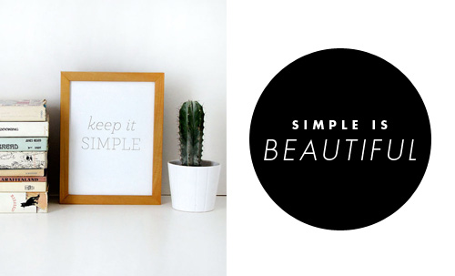
Source: Acorn & Whale letterpress print Scout’s Honor via Simple-Pretty Source: Fellow Studio Source: Little Factory Now that we finished our new design for our website, we are planing on re-designing all the other things that go along with our identity: letterhead, packaging etc. I’m really excited about this. At the same time designing for yourself is usually the hardest, but as Barney Stinson would say, …
New Website Design!
Drumroll please… As you can see we re-designed our website! It’s has been in the making since the beginning of January. Jake spent numerous nights coding late into the night. You can thank him for the cool fade rollovers on the navigation. That’s probably my favorite part. We are so excited to finally be able to show it off. It took us a little while to decide on …
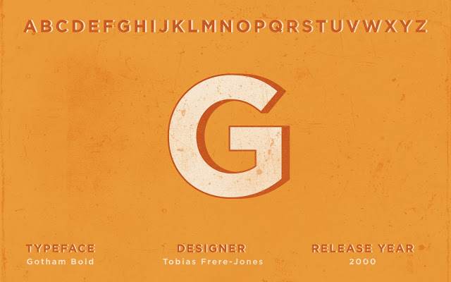
The Face of Type “G”
Can you believe we’re already into the second month of the year? It feels like it’s taken us this long just to get back into our regular routine since Christmas. Dont tell anyone, but we didn’t even take our Christmas tree down until last weekend! In case you hadn’t noticed, we kind of dropped the ball last month with the …
Showing 51–60 of 138 results
